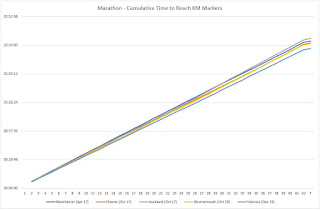
Marathon Analysis in 10 Charts

In both my work and private life I'm a real stats geek and can happily bury my head in an Excel spreadsheet for most of the day. So much so that when planning a holiday I'll crack open a spreadsheet for some reason or another; my wife often complains that I then manage to turn something that should be really exciting into something exceptionally boring! When it comes to running, the opportunities for analysing performance are almost endless, more so now that we can readily access GPS watches that hold all sorts of data. Nonetheless I often find the analysis on Strava really interesting, but at the same time I'm always craving more. In my work life I often tell others that the easy bit is to provide data, but how can you convert that data into intelligence? I therefore set out to look back at the five marathons I've run and see whether there is a way to determine something a bit more meaningful. This is quite a long read and you may get bored by the end of...